How to Draw a Line in R Plot
R language comes with a graphics package with a generic function called plot(), which is versatile and can be used to create different types of (X, Y) plots with points and lines.
plot function in R
The plot in R is a built-in generic method for plotting objects. The plot() isn't a single defined function but a placeholder for a family of related functions. What I mean by this is that a plot has many optional arguments which can be passed according to the type of object passed and your requirement.
To plot a chart of an Object in R, use the plot() function. Point and line plots can be produced using the
Syntax
plot ( x , y , type , main , xlab , ylab , pch , col , las , bty , bg , cex , … ) Parameters
Thexis the coordinates of points in the plot.
The y is the coordinates of points in the plot.
main: It is an overall title for the plot.
xlab: It is a label for the x-axis.
ylab: It is the label for the y-axis.
pch: It is the shape of points.
col: It is the foreground color of symbols as well as lines.
las: It is the axes label style.
bty: It is the type of box round the plot area.
bg: It is the background color of symbols (only 21 through 25).
cex: It is an amount of scaling plotting text and symbols.
…They are the arguments to be passed to methods.
- "p" for points plot,
- "l" for a line plot,
- "b" for both plots,
- "c" for the part of the line alone of "b",
- "o" for both "overplotted",
- "h" for 'histogram' like (or "high-density") vertical lines.
- "s" for stair steps,
- "S" for other steps, see 'Details' below,
- "n" for no plotting.
Example
Let's use the equation y = x^3. This means we will define two vectors, x, y, and y is the cube of x.
x <- c(1, 2, 3, 4, 5) y <- c(1, 8, 27, 64, 125) Now, let's plot the y = x^3 values on the line plot. To create a line plot, pass the parameter type = "l" inside the plot function.
x <- c(1, 2, 3, 4, 5) y <- c(1, 8, 27, 64, 125) plot(x, y, type = "l") Output
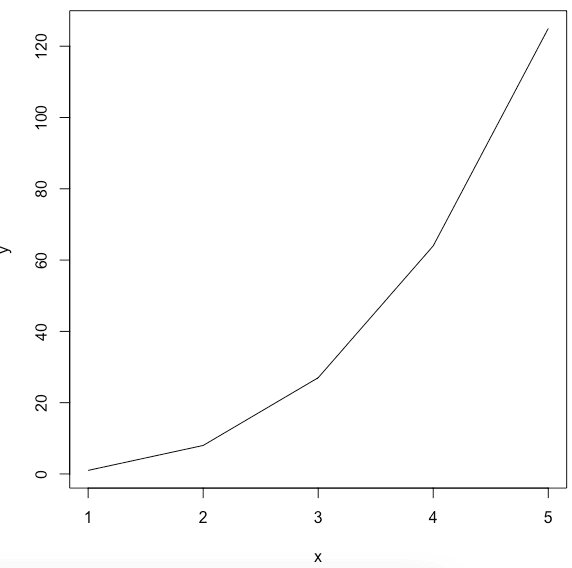
And we get the line chart of the y = x^3 function.
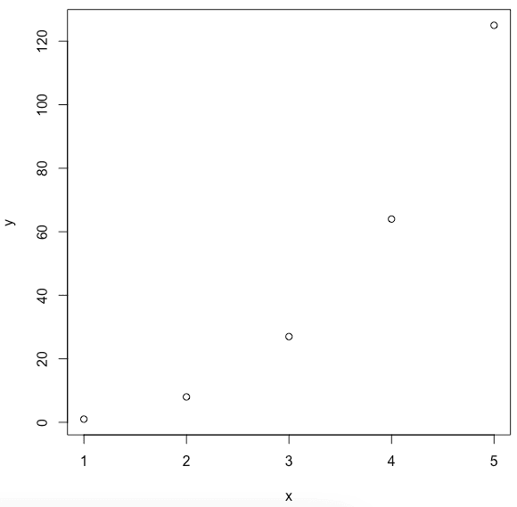
If we don't pass the type = "l" in the argument, it will return the points plot. By default, the plot() function returns point plot.
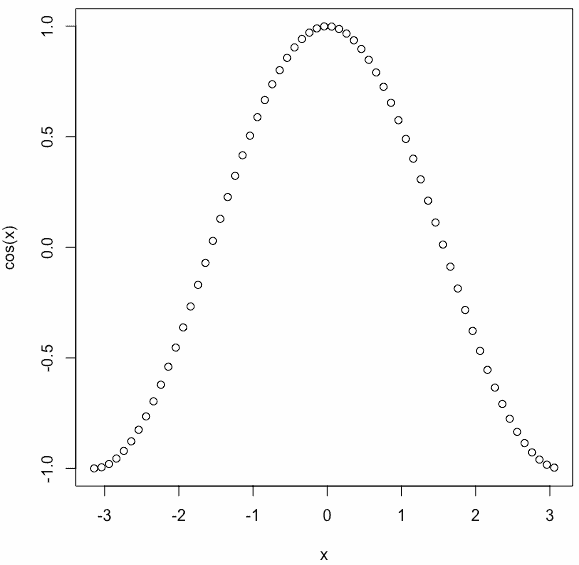
Plot the cos() function in R
To calculate the cosine value in R, use the cos() function. Next, we plot the sine function using the pi constant from the range -pi to pi.
x <- seq(-pi, pi, 0.1) plot(x, cos(x)) Output
Adding Titles and Labeling Axes
To add a title to our plot, use themainparameter and pass the name of your choice.
To label the x and y-axis, use the xlab and ylab arguments.
x <- seq(-pi, pi, 0.1) plot(x, cos(x), main = "Cos Function", ylab = "cos(x)") Output
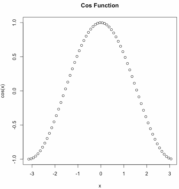
On the y -axis, you can see the label name cos(x).
Changing the symbols and colors of a plot in R
We can see above that the plot is of circular points and black in color. This is the default color.
Let's change the symbol using the pch parameter and use thecolparameter for choosing the color.
x <- seq(-pi, pi, 0.1) plot(x, cos(x), pch = c(4, 5, 6), col = c("red", "blue", "violet", "green")) Output
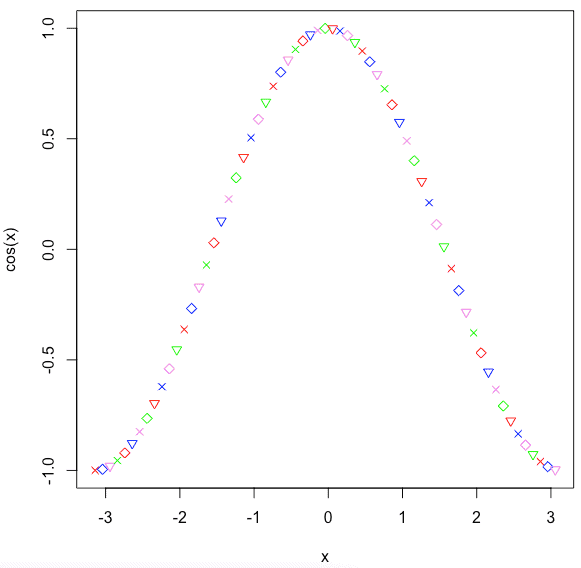
You can use the pch (plotting character) argument to specify symbols to use when plotting points. For example, for symbols 21 through 25, you can specify border color using col argument and fill color using bg argument.
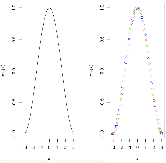
Plot multiple graphs into a single image in R
To combine multiple graphs into a single image, use the par() function.
Let's combine two graphs. 1st is a line chart, and 2nd is a point chart with different symbols and colors.
par(mfrow = c(1, 2)) x <- seq(-pi, pi, 0.1) plot(x, cos(x), type="l") plot(x, cos(x), pch = c(4, 5, 6), col = c("red", "blue", "violet", "green")) Output
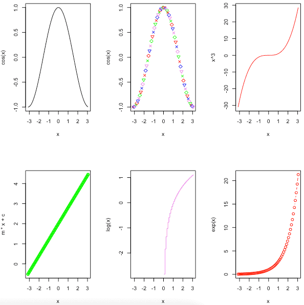
You can also add more graphs using the par() function. For example, let's add six graphs in one image in R.
par(mfrow = c(2, 3)) x <- seq(-pi, pi, 0.1) plot(x, cos(x), type = "l") plot(x, cos(x), pch = c(4, 5, 6), col = c("red", "blue", "violet", "green")) plot(x, x ^ 3, col = "red", type = "l") m <- 0.8 c <- 2 plot(x, m * x + c, col = "green", type = "o", lwd = 2, lty = 1) plot(x, log(x), col = "violet", type = "s") plot(x, exp(x), col = "red", type = "b") Output
Overlaying Plots Using legend() function in R
In some cases, we need to overlay the plots to compare the results. To overlay the plot, use the lines() and points() methods to add lines and points, respectively, to the existing plot.
x <- seq(-pi, pi, 0.1) plot(x, cos(x), type = "l", main = "Overlaying Charts", ylab = "", col = "red") lines(x, sin(x), col = "blue") legend("topleft", c("sin(x)", "cos(x)"), fill = c("blue", "red")) Output
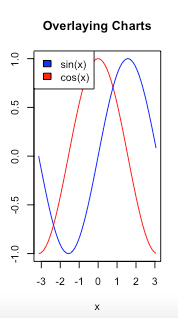
The legend() function in R is used to display the legend appropriately.
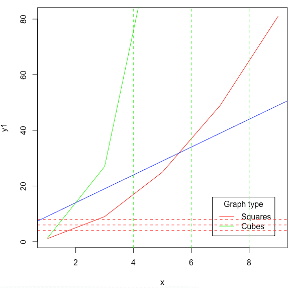
Adding Lines to a Plot in R
To add the straight line to the existing plot, use the abline() function.
The abline() is an inbuilt R method that takes four parameters, a, b, h, and v. The variables a and b represent the slope and intercept. The h represents the y points for horizontal lines, and v represents the x points for vertical lines.
x <- seq(1, 10, 2) y1 <- x ^ 2 y2 <- x ^ 3 plot(x, y1, type = "l", col = "red") lines(x, y2, col = "green") legend("bottomright", inset = 0.05, c("Squares", "Cubes"), lty = 1, col = c("red", "green"), title = "Graph type") abline(a = 4, b = 5, col = "blue") abline(h = c(4, 6, 8), col = "red", lty = 2) abline(v = c(4, 6, 8), col = "green", lty = 2) Output
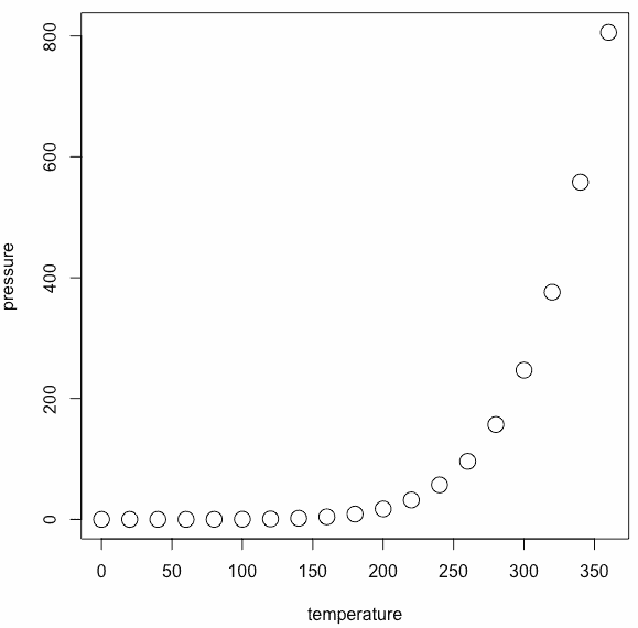
Create a Simple Plot using the dataset
R provides many inbuilt datasets, and for this example, we will use the pressure dataset.The pressure dataset contains observations of the vapor pressure of mercury over a range of temperatures.
Output
temperature pressure 1 0 0.0002 2 20 0.0012 3 40 0.0060 4 60 0.0300 5 80 0.0900 6 100 0.2700 To create a plot of the dataset, use the plot() function.
Output
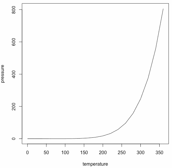
Here, we have plotted the line graph, but if you don't pass type="l," it will create a point chart.
Output

To modify the size of the plotted characters, use cex (character expansion) argument.
Output
The Axes Label Style
By specifying the las (label style) argument, you can change the axes label style. This changes the orientation angle of the labels.
See the following table of values.
| Value | Description |
| 0 | The default, parallel to the axis. |
| 1 | Always horizontal. |
| 2 | Perpendicular to the axis. |
| 3 | Always vertical. |
See the following example.

The Box Type of a Plot in R
To specify the box type in R, use the bty (box type) argument to change the type of box round the plot area.
See the following table of values.
| Value | Description |
| "o" | It is the default argument and draws the complete rectangle around the plot. |
| "n" | It draws nothing around the plot. |
| "l", "7", "c", "u", or "]" | It draws the shape around the plot area. |
Output

Add a Grid to a plot in R
To add a grid to a plot in R, use the grid() function to draw the grid once you call the plot().
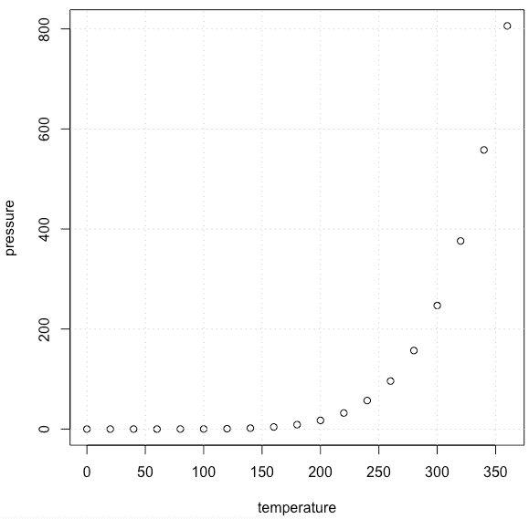
You can see the light-dotted line of a grid in the plot.
Save a Plot to an Image File
To save a plot to an image file in R, do the following things in order.
- Call a function to open a new graphics file, such as png(), jpg() or pdf().
- Then, call the plot() function to generate the graphics image.
- At last, call the dev.off() function to close the graphics file.
If you don't provide an external path, then it will save in your current directory.
See the following code.
png(filename = "mp.png", width = 625, height = 400) plot(pressure, col = "red", pch = 19, type = "b", main = "Vapor Pressure of Mercury", xlab = "Temperature (deg C)", ylab = "Pressure (mm of Hg)") dev.off() Output
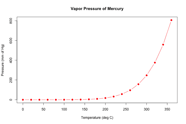
You check the downloaded png file inside your current directory.
Conclusion
In this example, we have seen what plot() function is, how to use the plot(is) function to create a point and line graph with different shapes, colors, with outbox, with box, with legend, with label values, and finally how to download the graph image.
That's it for this tutorial.
Source: https://r-lang.com/plot-function-in-r-with-example/
0 Response to "How to Draw a Line in R Plot"
Post a Comment